Architectural
Image & Character
Tyndall AFB Colors and Materials
The new color palette is to provide an updated aesthetic more representative and appealing to today’s Air Force 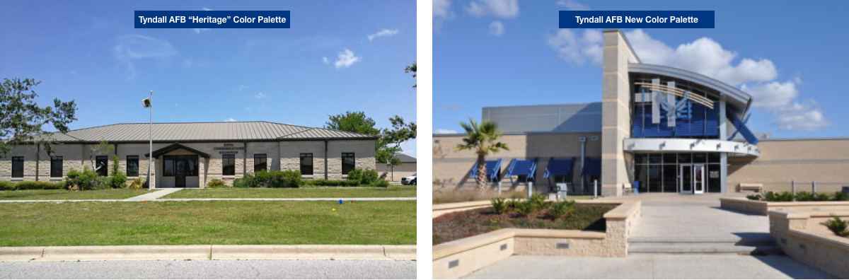
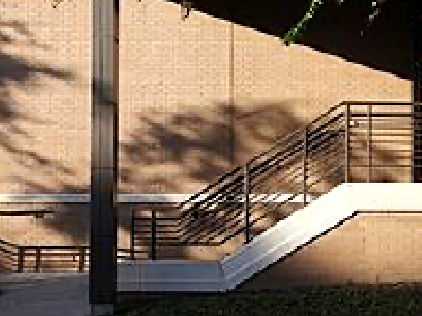
The existing installation facilities are characterized by the use of a variety of materials, colors, and textures, in addition to architectural styles. The predominant existing “Heritage” color palette includes medium tan split‐face and ground face CMU, medium tan and brown brick, “Creech” brown painted exterior doors and other surfaces (named after General Creech, who implemented facility-wide use of consistent brown and sandstone colors), bronze anodized window and storefront frames, and medium bronze roofing, fascia, and soffits. In contrast to the predominant existing context of buildings with darker and warmer color tones, the new color palette, similar to the Fitness Center, uses lighter, cooler tones, while still being neutral in character appropriate to the natural environment. A mixture of materials, including split face and burnished face block, metal wall panels, and increased glazed areas, as well as integral shading devices, creates a pleasing aesthetic appropriate to the facility use as well as its coastal location.
The intent of the new color palette is to provide an updated aesthetic more representative and appealing to the airmen and women of today’s Air Force for improved morale and pride of place. The new palette creates a state-of-the art appearance that differentiates new facilities from existing while still maintaining a consistent overall architectural character across the installation.
Colors and materials indicated are not meant to be all-inclusive or proprietary, but to give direction regarding the intended color palette and development of architectural character appropriate for Tyndall AFB. For use and application of materials and additional detail, refer to the Design Intent, Architectural Image & Character section of this website.
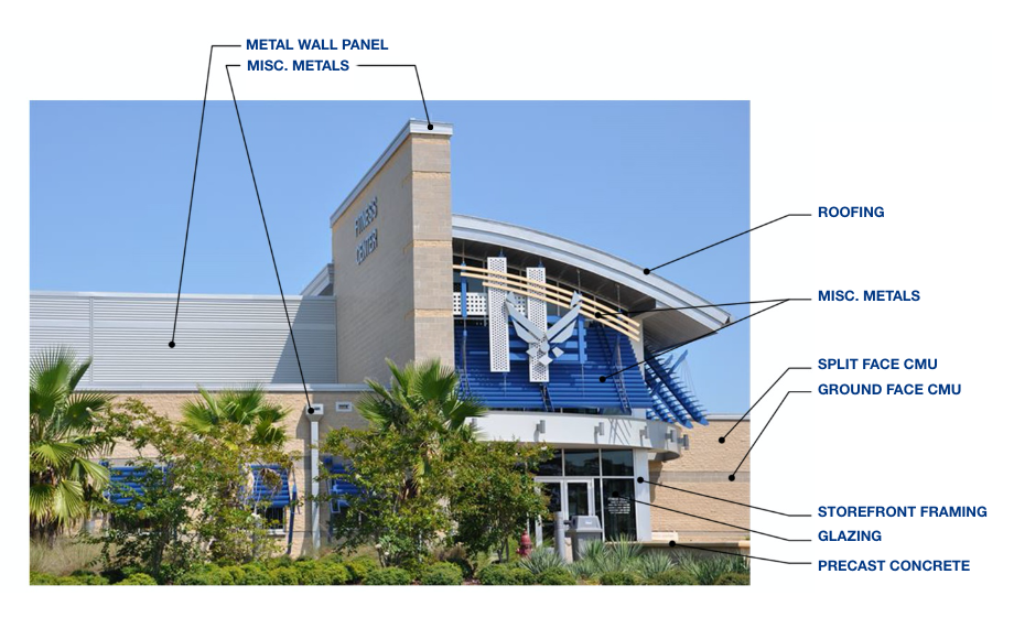
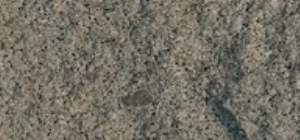
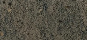
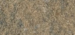
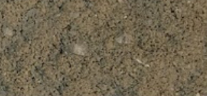
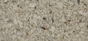
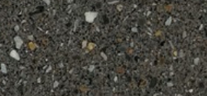
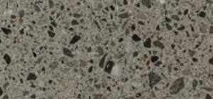
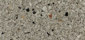
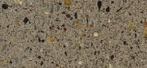
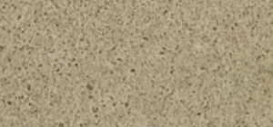
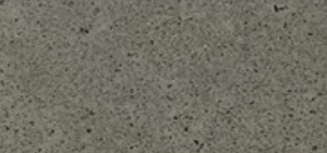
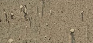
Sample Materials and Finishes
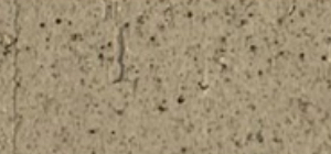
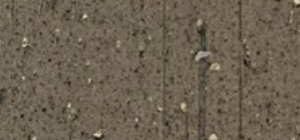
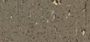
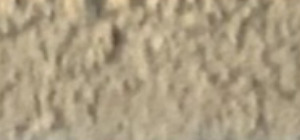
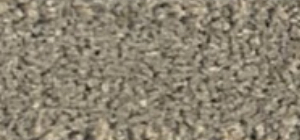
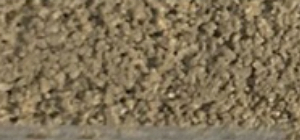
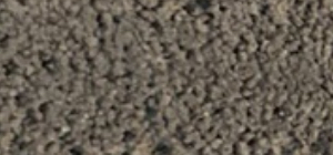
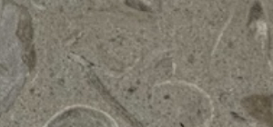
Representation of the desired color, material and finish for Tyndall AFB.
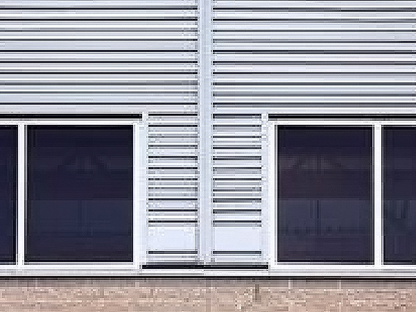
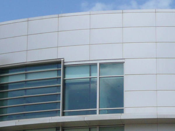
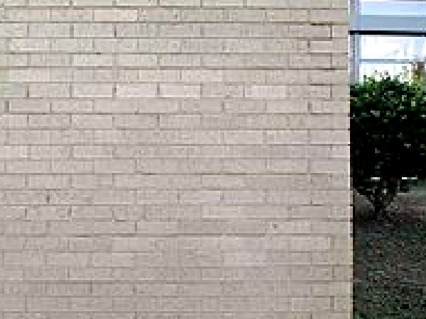
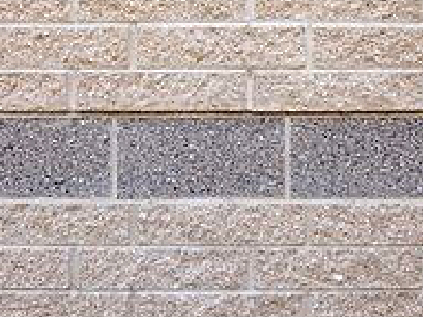
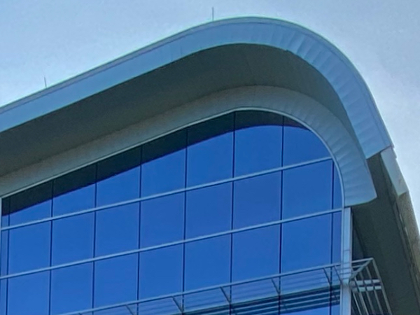
- Overall: light, neutral, tones with metallic complements.
Exception: where matching existing materials on a building repair or addition - Split face, smooth face, and burnished face CMU in light tan or light gray
- CMU narrow units in light tan with white flecks, light gray with dark flecks
- Architectural precast in light beige and light gray
- Modular brick masonry in light tan, buff, parchment, or light gray
- Aluminum composite panel, dry seal in clear anodized or matte finish silver
- Insulated composite panel in clear anodized or matte finish silver
- Profiled metal wall panel in clear anodized or matte finish silver
- Storefront framing in clear anodized aluminum
- Vision glazing in light blue tinted composites
- Spandrel glazing in white or gray
- Accent finish colors for architectural components to be used in moderation using Air Force Blue as the basis
- Standing‐seam metal roofing in matte metallic silver
- Hollow metal doors and frames field painted to match adjacent walls
- Gutters and downspouts to match roof color (light-colored walls will allow roof‐colored downspouts to be diminished)
- Handrails and guardrails in clear anodized aluminum
- Exterior door hardware in brushed stainless steel
Samples
Identify basis-of-design colors, and finishes for use by A/E firms.
The images included on this page are photographs of actual samples. They are provided to identify basis-of-design colors, and finishes for use by A/E firms in selecting and coordinating actual color selections. It is recommended that basis-of-design samples be used for comparison of colors and finishes from other vendors. This is not a directive to use the example vendor, it is only a representation of the desired color, material and finish.


Colors
These colors should be used to supplement, not replace.
Pantone colors are provided to approximate colors of physical samples for use by A/E firms unable to review the basis-of-design samples onsite. These colors should be used to supplement, not replace, physical samples. It is recommended that basis-of-design samples be used for comparison of colors and finishes from other vendors.